TL;DR
Post-level reporting strips all the context that actually makes a trend make sense
Viral spikes and compounding formats look identical in a dashboard; they're not
Real growth comes from grouping trends over time, not ranking individual posts
Tagging content by type and intent turns recaps into an actual strategy
The brands winning right now aren't chasing peaks; they're reading patterns
Table of Contents
- TL;DR
- Why every trend spike looks the same (but isn't)
- What happens when you actually zoom out
- The reason trend participation feels random
- From leaderboard to pattern map
- What high-growth teams are doing differently
- How to start actually reading patterns (not just recaps)
- The actual goal: make trends work for you, not the other way around
Here's the scenario: a post blows up. The reach numbers look incredible. The team celebrates, screenshots the dashboard, and moves on to the next piece of content, probably another trend play because hey, that one worked, right?
Then the next trend post tanks. And the one after that performs somewhere in the middle. The cycle repeats, and the whole thing starts to feel like a guessing game.
Here's the thing: it's not the algorithm. It's the reporting structure.
Most social media analytics are still built around post-level performance, meaning every piece of content gets evaluated in isolation. A reactive trend post, a paid campaign asset, and a slow-burn evergreen format sit next to each other in the same dashboard, ranked side by side like they're playing the same game. They're not.
That's the blind spot. And it's costing teams actual growth.
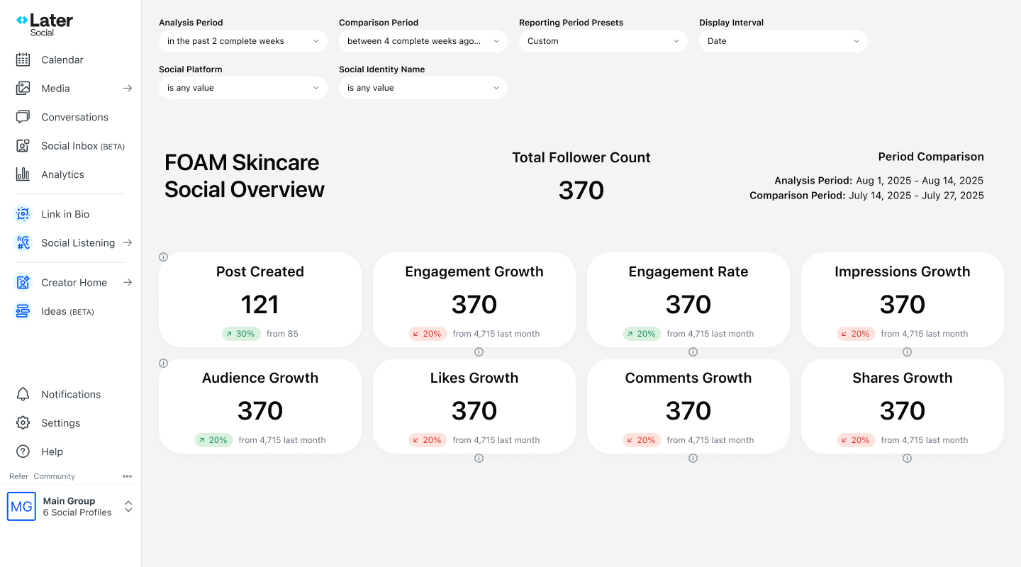
This post breaks down why post-level reporting distorts trend strategy, what zooming out actually reveals, and how teams are using tools like Later's custom analytics and post tagging to turn their dashboards from a recap into a roadmap.
Why every trend spike looks the same (but isn't)
Take what happened in early 2025 when the "office-to-outfit" aesthetic started cycling through TikTok and Pinterest simultaneously. Some brands jumped on it, got a massive week of impressions, and then, nothing. Other brands built a serialized version of the format, posted it consistently over six weeks, and ended up with a measurable uptick in saves, follows, and repeat engagement.
Both showed up as "high-performing content" in a standard dashboard.
The problem is that a dashboard sorted by reach or engagement will flatten three very different performance behaviors into one visual:
Short-term exposure spikes — trend participation that drives visibility for 24–72 hours and then decays rapidly.
Campaign-driven arcs — content that performs within a defined window tied to a launch, promotion, or moment, then tapers.
Compounding formats — recurring content types that improve over time, building audience expectations and retention signals like saves, shares, and repeat comments.
All three can register similar numbers in the same week. But they're doing completely different things strategically. Treating them as equals is where the guessing game begins.
What happens when you actually zoom out
When content is grouped by theme, format, or intent and evaluated across weeks or months instead of individual posts, a different picture starts forming.
The trend posts? They show sharp lift and rapid decay, useful for exposure, not for retention.
The campaign content? Controlled rise and taper. Predictable if you know when to expect it.
The evergreen formats? Gradual, consistent improvement, especially in the engagement signals that actually point to audience quality: saves, shares, profile visits, repeat commenters.
This is the difference between exposure and momentum.
Exposure gets a post seen. Momentum builds an audience.
One of the clearest examples of this played out with brands participating in the AI-generated aesthetic backlash that picked up steam in late 2025. Teams that tracked performance by format, not just by post, could see that their "proof of human creativity" content (BTS footage, hand-drawn sketches, real-team moments) consistently outperformed trend reaction posts on every retention metric, even when the reach numbers were lower.
Brands that were only looking at the dashboard? They kept optimizing for reach. Brands that zoomed out? They started investing in the format.
The reason trend participation feels random
This one's worth sitting with for a second.
The inconsistency that shows up in trend performance, one trend drives record engagement, the next barely registers, and often gets blamed on the algorithm or audience unpredictability. And sometimes that's fair. But more often, the volatility is a reporting problem, not a content problem.
When performance is only measured by immediate reach and engagement rate, the only visible signal is spike magnitude. There's no way to tell if a trend drove actual community behavior or just impressions.
Meaningful trend analysis needs to account for:
Performance persistence — did the engagement hold for more than 48 hours?
Retention behavior — are similar formats building repeat interaction over time?
Cross-platform carry — did the trend travel or stay contained to one platform?
Sentiment and adaptation — is the audience shaping the format or just reacting to it?
The Brat summer-to-Brat fall cycle in 2024 was a perfect case study here. Brands that tracked persistence and sentiment alongside reach could see the format evolving in real time. Brands that only looked at peak engagement missed the window where participation went from timely to overplayed, and posted into the tail end anyway.
Post tagging by trend stage (early adoption, peak, saturation, post-trend) turns that kind of pattern into a replicable read, not just hindsight.
From leaderboard to pattern map
Most dashboards are essentially leaderboards. They rank posts by metrics. Leaderboards are good for snapshots. They are not designed for forecasting.
A pattern map does something different. It answers:
Which content themes are generating engagement that compounds over time?
Which trend formats get better the more they're repeated?
Which spikes are one-offs vs. entry points for a repeatable format?
Which campaign efforts generate residual lift after the window closes?
The shift from leaderboard to pattern map requires two things: tagging content by intent when it's scheduled, and grouping that content in analytics to compare like with like over time.
Later's post tagging and custom analytics are built specifically for this workflow, tagging at the scheduling stage so the data is clean when it's time to analyze, and grouping by label to compare content categories side by side across any timeframe. It's not a massive operational lift, but it changes what the reporting actually shows.
What high-growth teams are doing differently
The teams consistently outperforming right now aren't the ones with the fastest trend reaction times. They're the ones who've built a system for evaluating which trends are worth iterating on.
Instead of asking "did this trend perform?" they're asking "does this trend align with our compounding formats?"
Instead of optimizing for single-post virality, they're optimizing for repeatable performance behaviors, formats that their audience recognizes, expects, and engages with consistently.
This played out visibly in how DTC brands handled the "de-influencing meets brand authenticity" content wave that dominated feeds through mid-2025. The brands that treated it as a one-off trend moment got a week of impressions. The brands that identified it as an extension of their existing transparency content built a format around it, tagged it consistently, tracked it over time, and now have data showing it's their highest-retention content category.
That's the difference between reactive and strategic. And it starts in the analytics.
How to start actually reading patterns (not just recaps)
None of this requires a complete analytics overhaul. It starts with a few intentional changes:
Tag before you post. Assign content categories at the scheduling stage — trend play, evergreen, campaign, format test — so the data is organized before it needs to be analyzed.
Group instead of rank. Pull performance by content category across a 30–90 day window instead of looking at individual post rankings.
Track the right signals. For trend evaluation specifically, weight saves, shares, and repeat engagement higher than reach. Those are the signals that indicate whether a trend is building something or just making noise.
Compare format iterations. If a format ran six times, how did performance change from the first to the sixth? That trajectory is the actual data point.
Later's custom analytics dashboard makes the grouping and comparison part straightforward, especially for teams managing multiple content pillars across platforms without a dedicated analyst.

The actual goal: make trends work for you, not the other way around
Not every trend deserves a full-format investment. Some should stay for one-time exposure plays. The goal isn't to turn every trending moment into a content series; it's to know which ones have that potential before it's obvious.
That's what zooming out makes possible.
Dashboards aren't the problem. Post-level reporting isn't going away, and it shouldn't; it's still the base layer of performance visibility. The opportunity is in building on top of it. Structured analytics, consistent tagging, and grouped reporting turn a recap tool into a growth system.
In a social landscape where trends move faster than weekly reporting cycles, that system is what separates teams that are always reacting from teams that are actually building something.
Want to see how Later's post tagging and custom analytics can help your team track trend performance over time? Explore Later's analytics features


